
Back
Lyvely
Oct 2024
-
Apr 2026
Details
Role
Product Designer
Focus
UI Design, UX Strategy, Design Systems, Payments UX, Gamification

Dave Catudal
Co-Founder & Growth Architect at Lyvely

...Luka is an exceptionally talented designer, one of those rare people who combines strong creative instinct with a deep understanding of product and user experience...
Overview
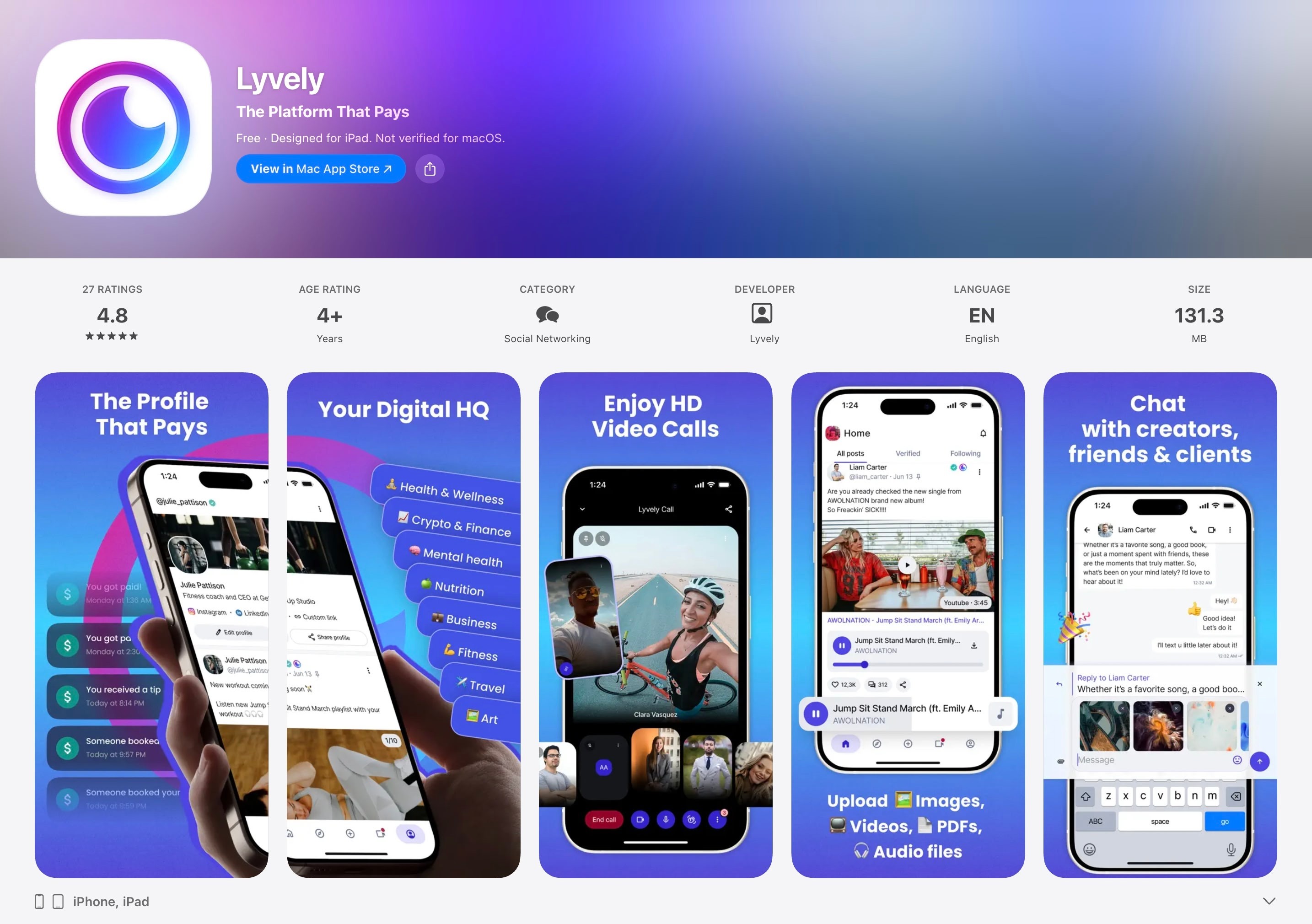
Lyvely is a creator platform. People post content, sell memberships, book one to one sessions, take video calls with their audience and get tipped for it. It started out serving the UAE, and later moved into Africa, as well.
I joined as the product designer responsible for owning every monetization feature and worked alongside a remote team of around 15 to 20 people across web, mobile, and backend.
But after a few months, I was the sole product designer in charge of the entire product, on every platform.
During my time at Lyvely I designed across the entire product: the design system rollout, settings, the creator dashboard, video calls and recordings, the payments layer, and the gamification system built to bring people back.
Outcome
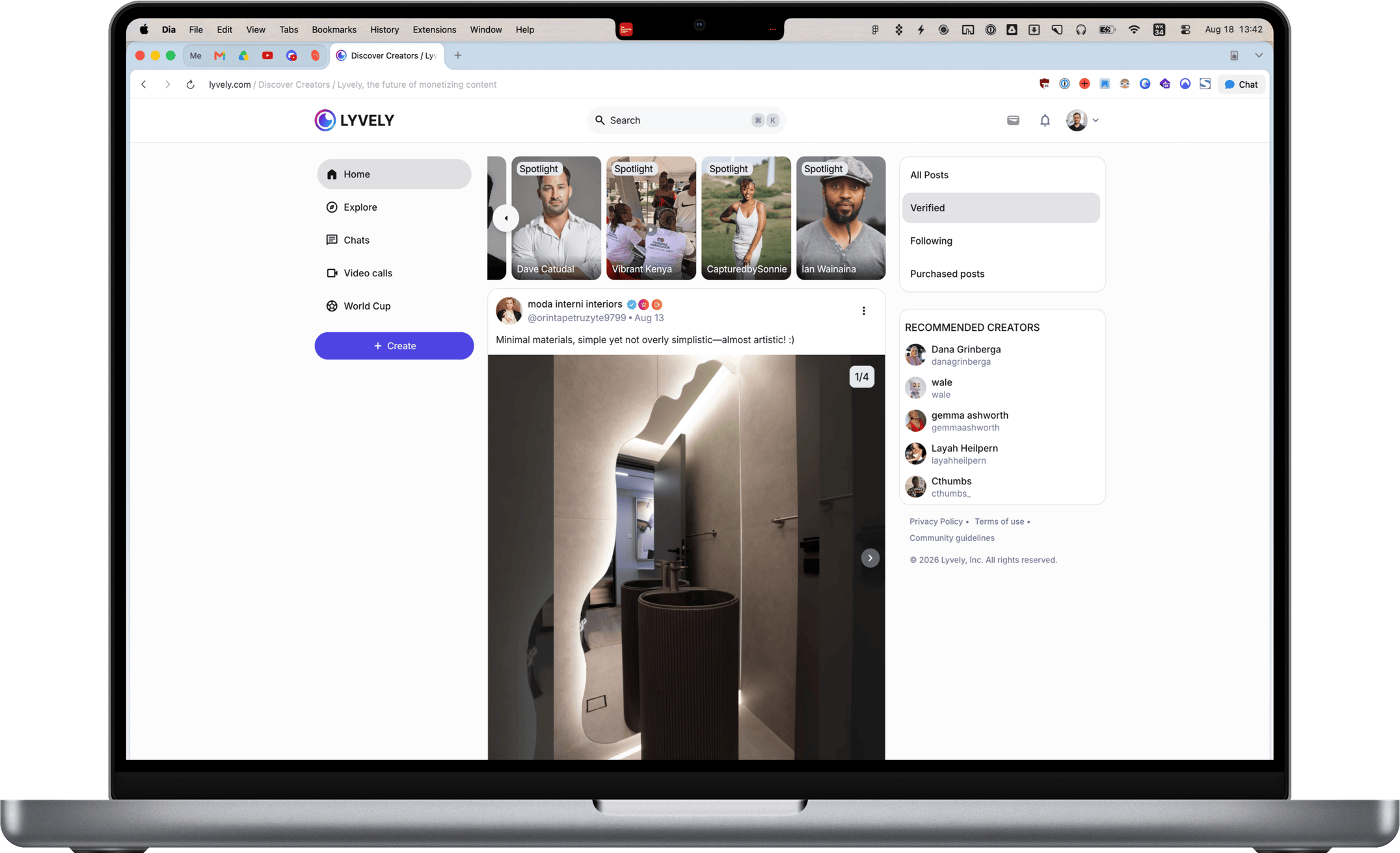
The product shipped continuously across web, iOS and Android for the length of the engagement.
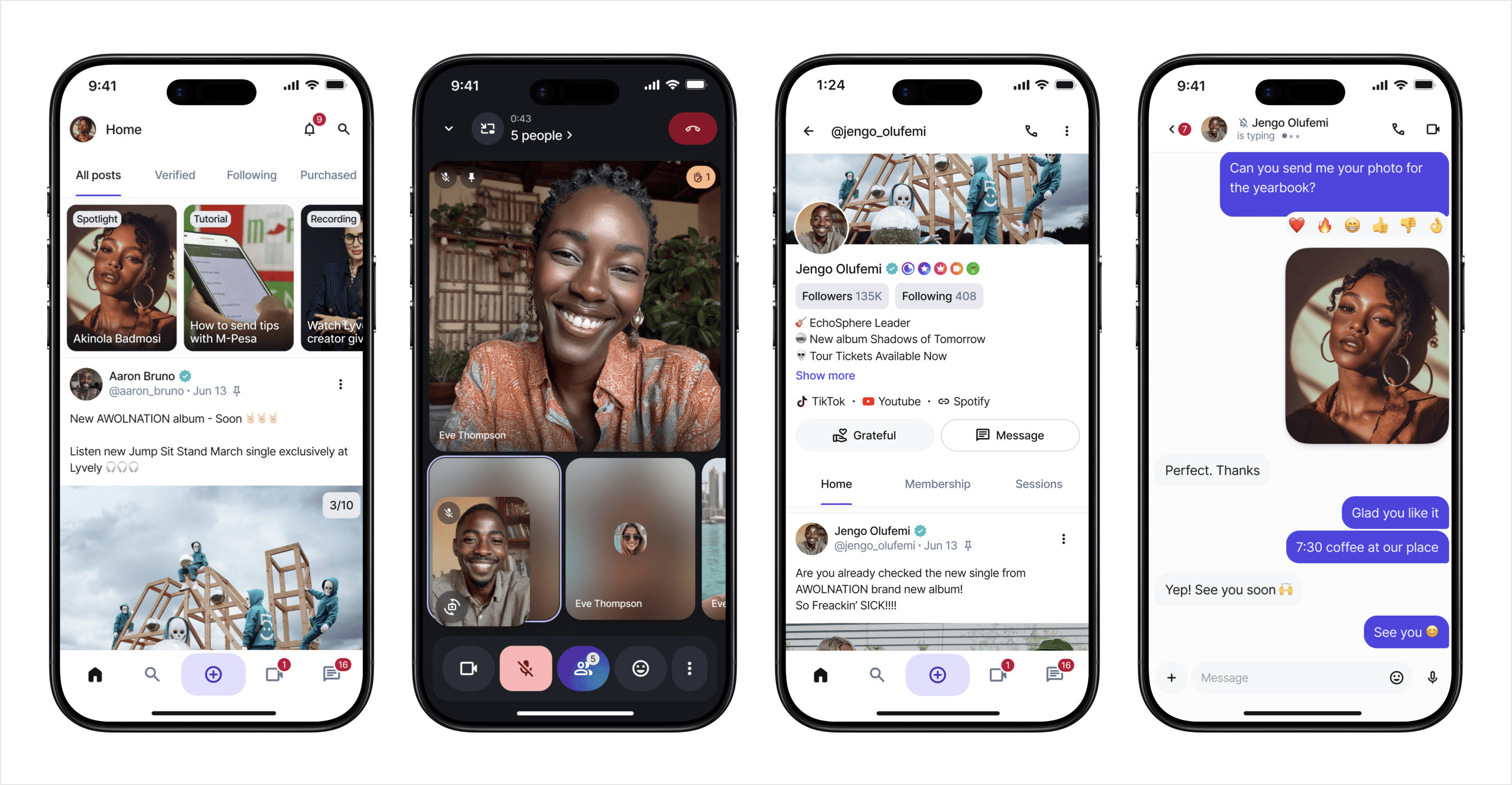
Tipping went live on mobile first, then extended to pay-to-view posts, sessions and memberships. The Africa launch followed. Live streaming shipped on web and mobile. Games, leaderboards and a points system landed within weeks of each other.
Process
Designing payments for two very different wallets
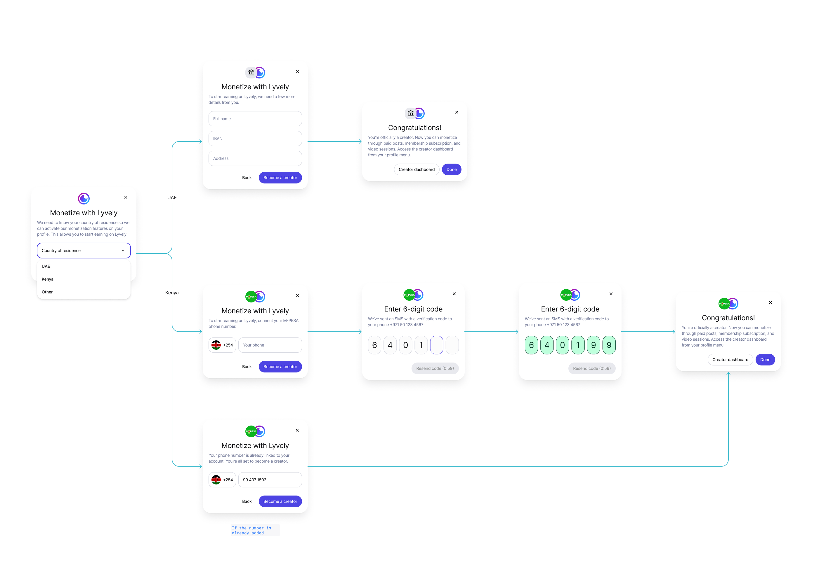
The platform had to run two payment rails at once without asking the user to understand either of them.
I mapped the flows around location instead of settings. A user in the UAE sees a card checkout. A user in Kenya sees a phone number for the M-PESA payment processor.
The tip button looks the same in both places. Currency defaults to the user's region and stays changeable in billing.
The harder problems were the edges. What a creator sees when their audience pays in a currency they do not hold. What happens to the tip button when the person receiving it has no wallet connected. Which features quietly disappear when a provider does not operate in someone's country.
Making paid content worth unlocking
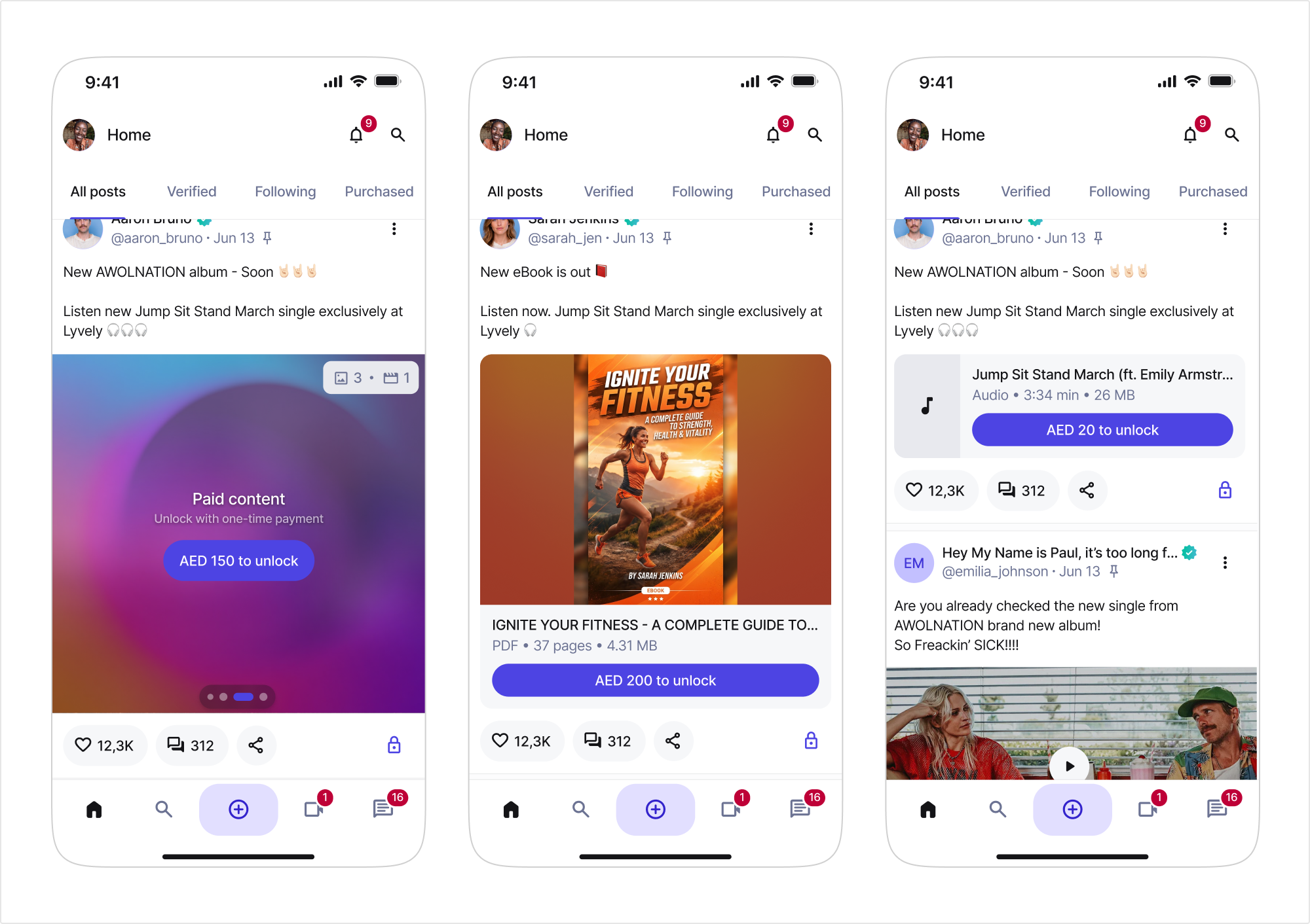
Locked posts were showing up as blank grey blocks. There was nothing to attract buyers.
I redesigned the preview so the post still communicates something before payment. Blurred imagery instead of a blank frame. Chips describing exactly what is inside, like three images and one video. PDFs showing the first page, the page count and the file size. Audio showing duration.
The buyer now knows what they are getting, and the creator sees their sales increase. It’s a win-win.
Rebuilding the calling experience
Video calls were the feature investors and partners asked about most, and the interface was scattered across menus.
Working with the founders, I brought the participants list out of the hidden menu and onto the main toolbar, and rearranged the control row with tooltips.
I designed a profile preview that opens inside the call so nobody has to leave the tab to see who they are talking to. Guests got labelled as guests.
Then recordings and AI summaries went on top: who can start one, who can see it afterwards, how it gets shared, and what an unauthorized person sees instead.
Fixing the parts nobody demos
Settings, security, blocked users, purchase history, notification copy. None of it makes a pitch deck.
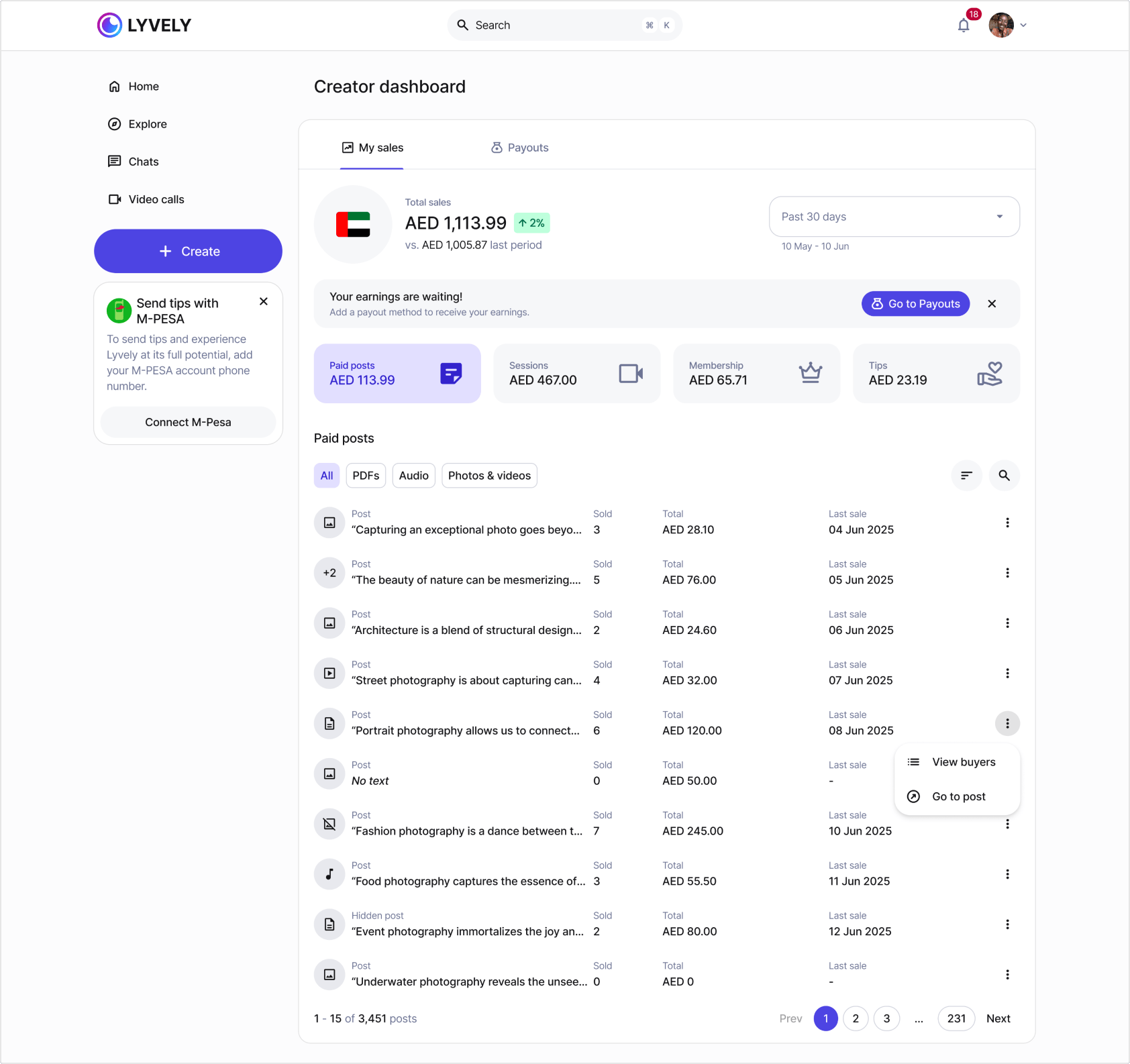
I rebuilt settings across web and mobile: profile with drag and drop custom links, active sessions by device and location, memberships, blocked users, referrals.
I added a "purchases" section so people could find what they had already paid for. This kind of work is invisible when done right.
Adding a reason to come back
User growth was the number that mattered. Retention was the way to protect it.
I designed a gamification layer on top of the existing product: a points system with weekly, monthly and yearly leaderboards, games surfaced in the explore page and directly in the feed, and a spotlight carousel at the top of the feed for live and featured content.
Points for paying actions stayed uncapped. Points for engagement got a daily ceiling, so the system rewarded real activity instead of comment farming.
Small thing I liked: a tap animation that highlights the specific item earning you points, so the first time you upload a cover photo you get obviously rewarded.
Reflection
The decisions that mattered most here had very little to do with visuals.
They came from asking what happens when a payment provider does not exist in someone's country, or when forty people join a call on a cheap Android phone, or when the only thing standing between a creator and a sale is a grey rectangle.
Designing for a market that was unfamiliar meant asking a lot of questions before drawing anything. That turned out to be the job. What helped a lot was AI.
Back
Back
Lyvely
Oct 2024
-
Apr 2026
Details
Role
Product Designer
Focus
UI Design, UX Strategy, Design Systems, Payments UX, Gamification
Dave Catudal
Co-Founder & Growth Architect at Lyvely
...Luka is an exceptionally talented designer, one of those rare people who combines strong creative instinct with a deep understanding of product and user experience...
Overview
Lyvely is a creator platform. People post content, sell memberships, book one to one sessions, take video calls with their audience and get tipped for it. It started out serving the UAE, and later moved into Africa, as well.
I joined as the product designer responsible for owning every monetization feature and worked alongside a remote team of around 15 to 20 people across web, mobile, and backend.
But after a few months, I was the sole product designer in charge of the entire product, on every platform.
During my time at Lyvely I designed across the entire product: the design system rollout, settings, the creator dashboard, video calls and recordings, the payments layer, and the gamification system built to bring people back.
Outcome
The product shipped continuously across web, iOS and Android for the length of the engagement.
Tipping went live on mobile first, then extended to pay-to-view posts, sessions and memberships. The Africa launch followed. Live streaming shipped on web and mobile. Games, leaderboards and a points system landed within weeks of each other.
Process
Designing payments for two very different wallets
The platform had to run two payment rails at once without asking the user to understand either of them.
I mapped the flows around location instead of settings. A user in the UAE sees a card checkout. A user in Kenya sees a phone number for the M-PESA payment processor.
The tip button looks the same in both places. Currency defaults to the user's region and stays changeable in billing.
The harder problems were the edges. What a creator sees when their audience pays in a currency they do not hold. What happens to the tip button when the person receiving it has no wallet connected. Which features quietly disappear when a provider does not operate in someone's country.
Making paid content worth unlocking
Locked posts were showing up as blank grey blocks. There was nothing to attract buyers.
I redesigned the preview so the post still communicates something before payment. Blurred imagery instead of a blank frame. Chips describing exactly what is inside, like three images and one video. PDFs showing the first page, the page count and the file size. Audio showing duration.
The buyer now knows what they are getting, and the creator sees their sales increase. It’s a win-win.
Rebuilding the calling experience
Video calls were the feature investors and partners asked about most, and the interface was scattered across menus.
Working with the founders, I brought the participants list out of the hidden menu and onto the main toolbar, and rearranged the control row with tooltips.
I designed a profile preview that opens inside the call so nobody has to leave the tab to see who they are talking to. Guests got labelled as guests.
Then recordings and AI summaries went on top: who can start one, who can see it afterwards, how it gets shared, and what an unauthorized person sees instead.
Fixing the parts nobody demos
Settings, security, blocked users, purchase history, notification copy. None of it makes a pitch deck.
I rebuilt settings across web and mobile: profile with drag and drop custom links, active sessions by device and location, memberships, blocked users, referrals.
I added a "purchases" section so people could find what they had already paid for. This kind of work is invisible when done right.
Adding a reason to come back
User growth was the number that mattered. Retention was the way to protect it.
I designed a gamification layer on top of the existing product: a points system with weekly, monthly and yearly leaderboards, games surfaced in the explore page and directly in the feed, and a spotlight carousel at the top of the feed for live and featured content.
Points for paying actions stayed uncapped. Points for engagement got a daily ceiling, so the system rewarded real activity instead of comment farming.
Small thing I liked: a tap animation that highlights the specific item earning you points, so the first time you upload a cover photo you get obviously rewarded.
Reflection
The decisions that mattered most here had very little to do with visuals.
They came from asking what happens when a payment provider does not exist in someone's country, or when forty people join a call on a cheap Android phone, or when the only thing standing between a creator and a sale is a grey rectangle.
Designing for a market that was unfamiliar meant asking a lot of questions before drawing anything. That turned out to be the job. What helped a lot was AI.
Back
Back
Lyvely
Oct 2024
-
Apr 2026
Details
Role
Product Designer
Focus
UI Design, UX Strategy, Design Systems, Payments UX, Gamification
Dave Catudal
Co-Founder & Growth Architect at Lyvely
...Luka is an exceptionally talented designer, one of those rare people who combines strong creative instinct with a deep understanding of product and user experience...
Overview
Lyvely is a creator platform. People post content, sell memberships, book one to one sessions, take video calls with their audience and get tipped for it. It started out serving the UAE, and later moved into Africa, as well.
I joined as the product designer responsible for owning every monetization feature and worked alongside a remote team of around 15 to 20 people across web, mobile, and backend.
But after a few months, I was the sole product designer in charge of the entire product, on every platform.
During my time at Lyvely I designed across the entire product: the design system rollout, settings, the creator dashboard, video calls and recordings, the payments layer, and the gamification system built to bring people back.
Outcome
The product shipped continuously across web, iOS and Android for the length of the engagement.
Tipping went live on mobile first, then extended to pay-to-view posts, sessions and memberships. The Africa launch followed. Live streaming shipped on web and mobile. Games, leaderboards and a points system landed within weeks of each other.
Process
Designing payments for two very different wallets
The platform had to run two payment rails at once without asking the user to understand either of them.
I mapped the flows around location instead of settings. A user in the UAE sees a card checkout. A user in Kenya sees a phone number for the M-PESA payment processor.
The tip button looks the same in both places. Currency defaults to the user's region and stays changeable in billing.
The harder problems were the edges. What a creator sees when their audience pays in a currency they do not hold. What happens to the tip button when the person receiving it has no wallet connected. Which features quietly disappear when a provider does not operate in someone's country.
Making paid content worth unlocking
Locked posts were showing up as blank grey blocks. There was nothing to attract buyers.
I redesigned the preview so the post still communicates something before payment. Blurred imagery instead of a blank frame. Chips describing exactly what is inside, like three images and one video. PDFs showing the first page, the page count and the file size. Audio showing duration.
The buyer now knows what they are getting, and the creator sees their sales increase. It’s a win-win.
Rebuilding the calling experience
Video calls were the feature investors and partners asked about most, and the interface was scattered across menus.
Working with the founders, I brought the participants list out of the hidden menu and onto the main toolbar, and rearranged the control row with tooltips.
I designed a profile preview that opens inside the call so nobody has to leave the tab to see who they are talking to. Guests got labelled as guests.
Then recordings and AI summaries went on top: who can start one, who can see it afterwards, how it gets shared, and what an unauthorized person sees instead.
Fixing the parts nobody demos
Settings, security, blocked users, purchase history, notification copy. None of it makes a pitch deck.
I rebuilt settings across web and mobile: profile with drag and drop custom links, active sessions by device and location, memberships, blocked users, referrals.
I added a "purchases" section so people could find what they had already paid for. This kind of work is invisible when done right.
Adding a reason to come back
User growth was the number that mattered. Retention was the way to protect it.
I designed a gamification layer on top of the existing product: a points system with weekly, monthly and yearly leaderboards, games surfaced in the explore page and directly in the feed, and a spotlight carousel at the top of the feed for live and featured content.
Points for paying actions stayed uncapped. Points for engagement got a daily ceiling, so the system rewarded real activity instead of comment farming.
Small thing I liked: a tap animation that highlights the specific item earning you points, so the first time you upload a cover photo you get obviously rewarded.
Reflection
The decisions that mattered most here had very little to do with visuals.
They came from asking what happens when a payment provider does not exist in someone's country, or when forty people join a call on a cheap Android phone, or when the only thing standing between a creator and a sale is a grey rectangle.
Designing for a market that was unfamiliar meant asking a lot of questions before drawing anything. That turned out to be the job. What helped a lot was AI.
Back